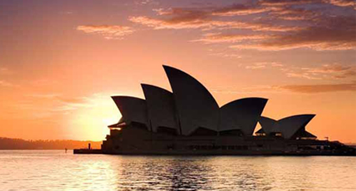
The Sydney Opera House: Classic case history of failure of design competition?
Google in 'Sydney' and you will find Sydney opera house as one of the first image results.
Its not uncommon that a city gets synonymous with its architectural icon. One cannot undermine the importance of such an icon on the urban fabric.
Sydney Opera House is the result of a design competition.
Design competitions are always exciting.
It shows how a similar brief gets varied responses from talented designers. It also give chances for the newcomers(except when they prefer to invite!). But most importantly, invariably, we expect something remarkable to get built, which makes it real exciting.
[Design for NAMOC Museum by selected architects which include Zaha, Gehry, Safdie, OMA, UNStudio]
The post "Are you in the wrapper business?" worries about architecture community giving more merit and importance to wrappers than its content. Not many competitions end up in disappointments though. But there are cases which, if observed closely can give valuable lessons for future.
Lets hear about this from an engineer (one of the most prolific in that!). In his classic 'The Evolution of Useful things', Henry Petroski takes the case of the architectural icon.
"Whether with bridges, skyscrapers, or any other structures or machines, it is the initial specification of function that certainly defines the problem to be solved and constrains the solution.
The Sydney Opera House is a classic case history of design competition and of what can go wrong with large projects. A total 223 entries were received for the performing-arts complex to be built in Sydney Harbour, and the competition was won on by the freehand sketches of the Danish architect Jorn Utzon. His design was a striking assemblage of huge shells that evoked sailing boats, but it omitted any consideration of engineering factors, which made the design highly impractical and the structure extremely difficult to build. Even though the Opera House generally was regarded as an architectural and engineering masterpiece upon its completion in 1973, it opened nine years late and more than 1400 percent over its original budget. The architect's obsession with (arbitrary) form had necessitated many ad-hoc engineering decisions in the course of the building’s erection, and little thought was given to maintenance. In 1989, with hundreds of repair projects deferred and with increasing leaks developing in the opera-house complex, a ten-year rehabilitation program was announced at a cost of $75 million. The form remains one of Sydney's most striking and recognizable visual images, but its function leaves some things to be desired. Unfortunately, the form of an opera house can not respond to failure so quickly as can the form of motorcycles, tractors, or even silverware."
Though one can read between lines his light contempt for the artist, the lessons cannot be ignored. Hope the jury is listening!
Photo Courtesies:
http://www.sydneycharterbus.com.au
en.wikipedia.org
Its not uncommon that a city gets synonymous with its architectural icon. One cannot undermine the importance of such an icon on the urban fabric.
Sydney Opera House is the result of a design competition.
Design competitions are always exciting.
It shows how a similar brief gets varied responses from talented designers. It also give chances for the newcomers(except when they prefer to invite!). But most importantly, invariably, we expect something remarkable to get built, which makes it real exciting.
[Design for NAMOC Museum by selected architects which include Zaha, Gehry, Safdie, OMA, UNStudio]
The post "Are you in the wrapper business?" worries about architecture community giving more merit and importance to wrappers than its content. Not many competitions end up in disappointments though. But there are cases which, if observed closely can give valuable lessons for future.
"THE FORM REMAINS ONE OF SYDNEY'S MOST STRIKING AND RECOGNIZABLE VISUAL IMAGES, BUT ITS FUNCTION LEAVES SOME THINGS TO BE DESIRED"
"Whether with bridges, skyscrapers, or any other structures or machines, it is the initial specification of function that certainly defines the problem to be solved and constrains the solution.
The Sydney Opera House is a classic case history of design competition and of what can go wrong with large projects. A total 223 entries were received for the performing-arts complex to be built in Sydney Harbour, and the competition was won on by the freehand sketches of the Danish architect Jorn Utzon. His design was a striking assemblage of huge shells that evoked sailing boats, but it omitted any consideration of engineering factors, which made the design highly impractical and the structure extremely difficult to build. Even though the Opera House generally was regarded as an architectural and engineering masterpiece upon its completion in 1973, it opened nine years late and more than 1400 percent over its original budget. The architect's obsession with (arbitrary) form had necessitated many ad-hoc engineering decisions in the course of the building’s erection, and little thought was given to maintenance. In 1989, with hundreds of repair projects deferred and with increasing leaks developing in the opera-house complex, a ten-year rehabilitation program was announced at a cost of $75 million. The form remains one of Sydney's most striking and recognizable visual images, but its function leaves some things to be desired. Unfortunately, the form of an opera house can not respond to failure so quickly as can the form of motorcycles, tractors, or even silverware."
Though one can read between lines his light contempt for the artist, the lessons cannot be ignored. Hope the jury is listening!
Photo Courtesies:
http://www.sydneycharterbus.com.au
en.wikipedia.org


Comments
Post a Comment